Brief
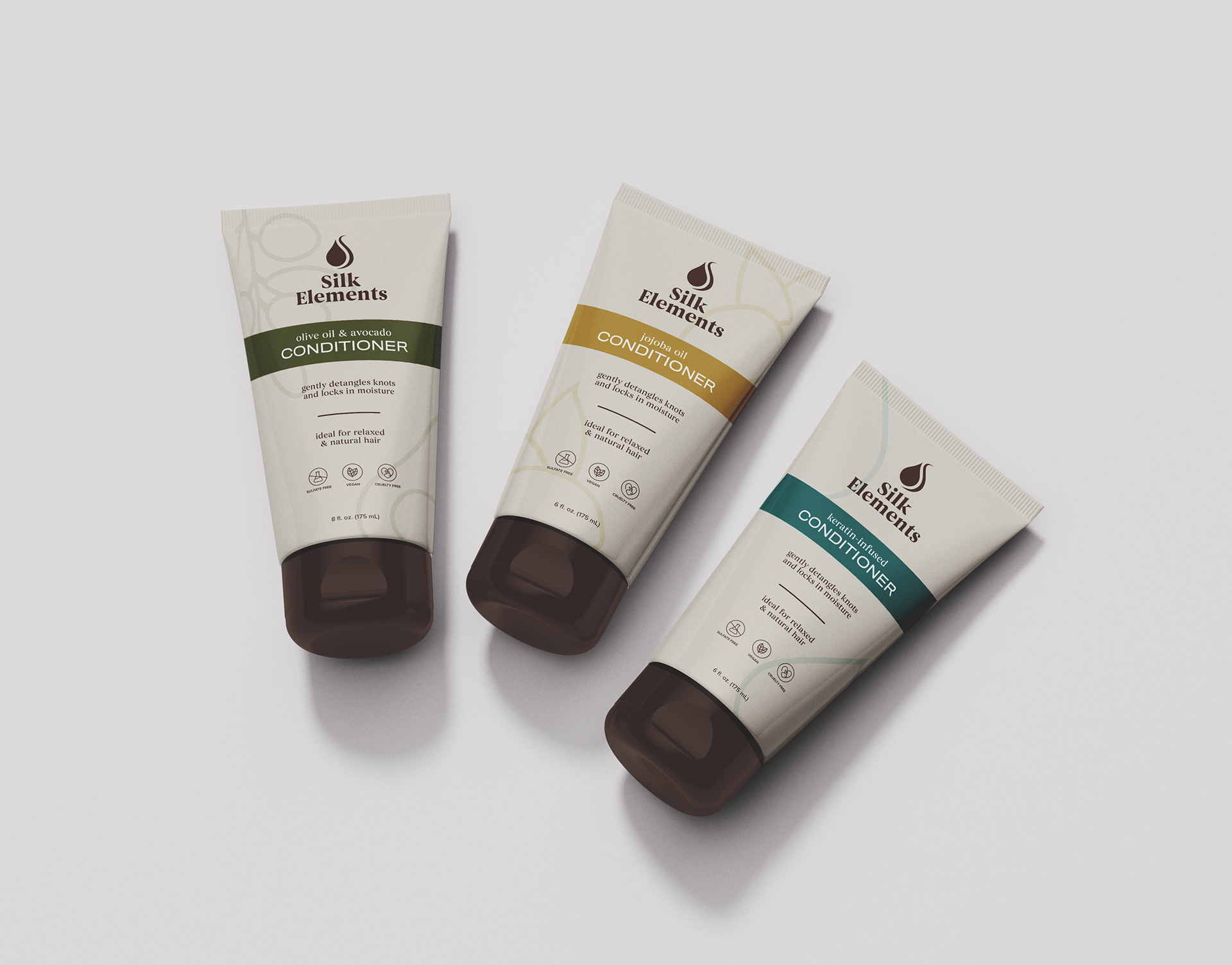
Refresh the Silk Elements visual identity to create a modern, yet elegant brand that matches their user. Silk Elements is a natural/textured hair care company that provides customers with quality, affordable products such as shampoo, conditioner, relaxer, heat protectant, edge control, and more.


The new System
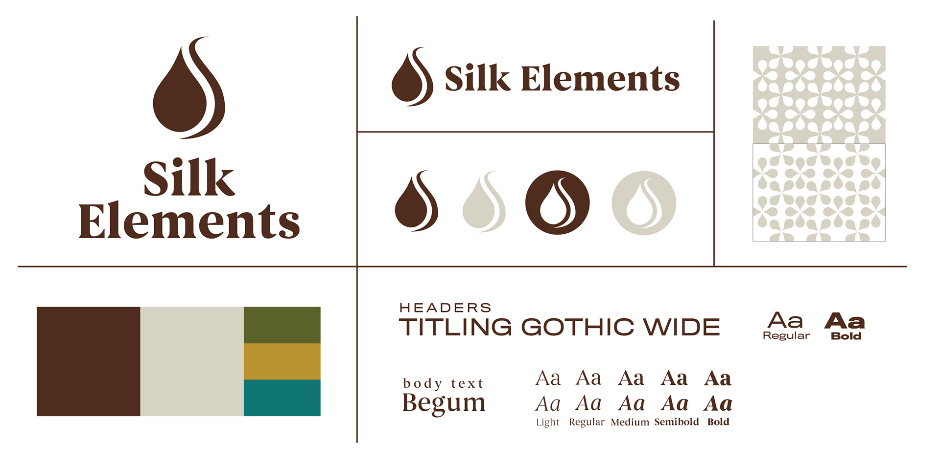
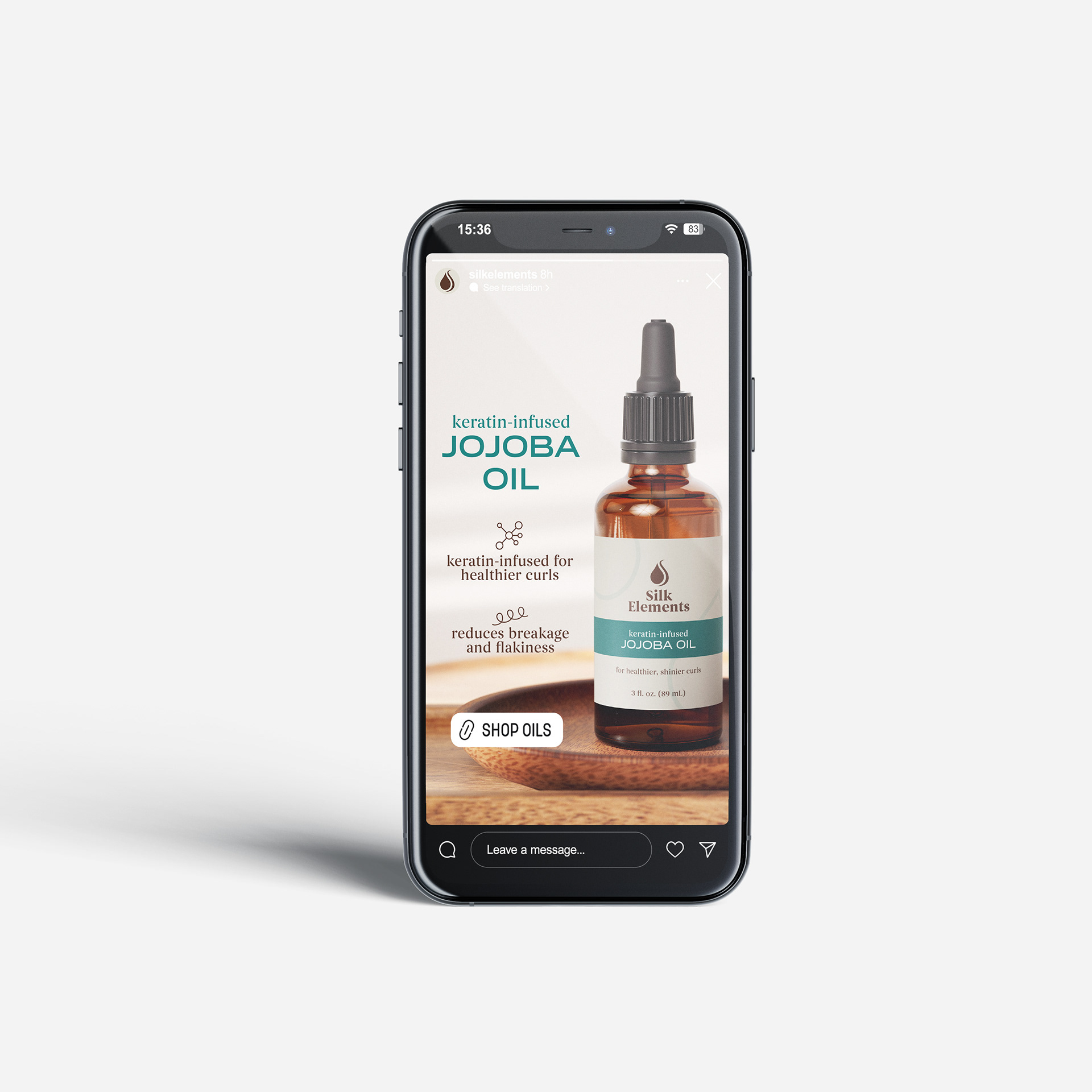
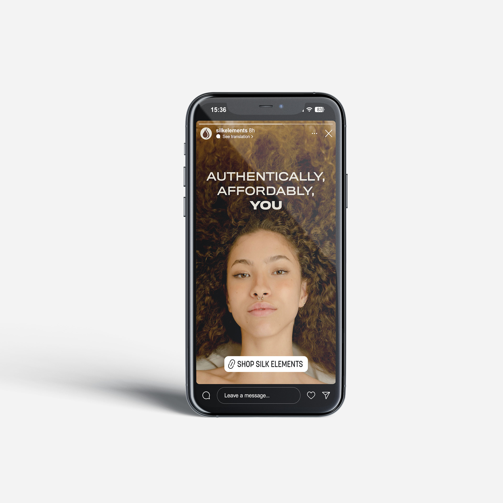
The new Silk Elements system reflects it modern consumer. The flowing droplet logo references nourishment and moisturized, healthy hair. Paired with bold, yet refined typography, the complete mark emphasizes the brand's unique fusion of natural, quality products at an affordable price tag. In application, earthy colors and authentic photography complete the brand's message.


process
The overall brand tone and voice are established through mind-mapping, ideation, mood boards, and preliminary logo sketching. From initial sketching a few ideas were selected, which were then distilled into three concepts, before one was ultimately refined into the final mark.
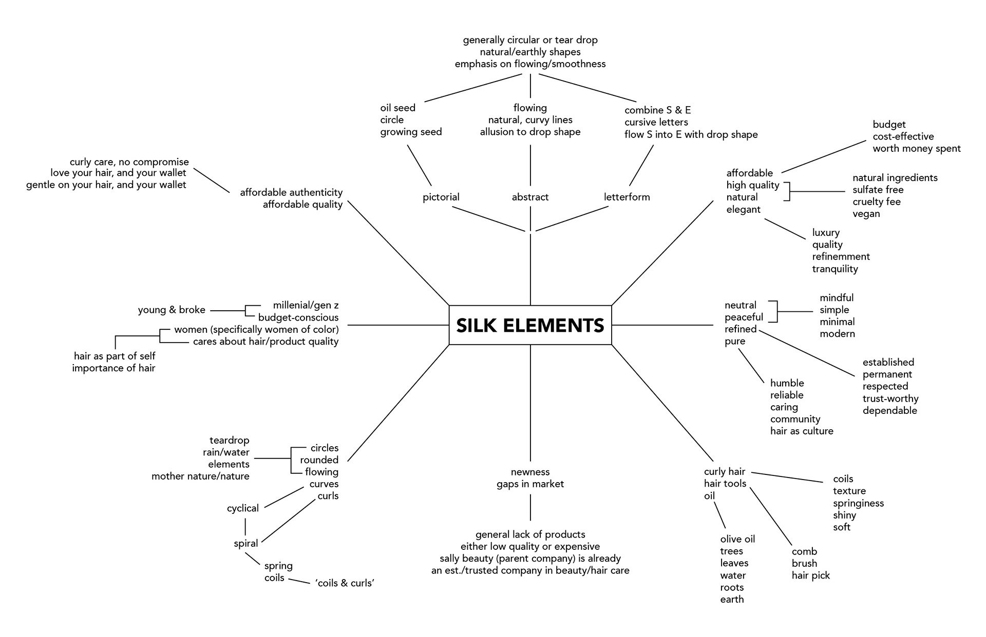
Mind-map
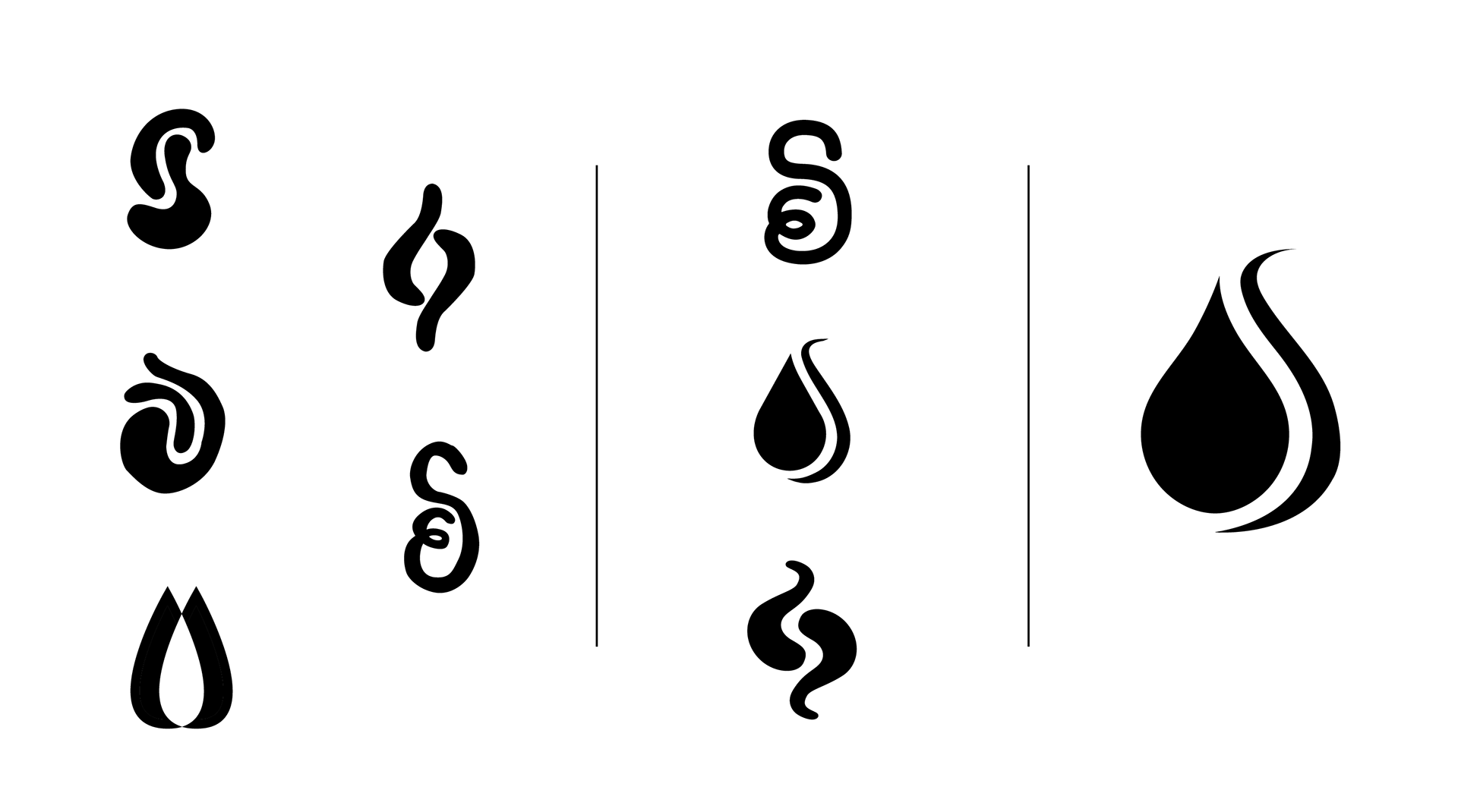
Logo process
Gallery Feature
This work was shown in the Fairbanks Hall Praxis Gallery in January 2025 as part of an annual graphic design student work showcase.
